Announcing kube-green rebranding

If you have been one of the early adopters of kube-green you may have noticed something different in these days. New colors, new shapes, and a brand new logo? What it's all about? You may also be wondering if you are on the right repository, and if this is the same kube-green you are familiar with: don't worry, it is! (Actually, a new version has been released: take a look at what's new on v0.4.1).
Well, we are proud to announce that kube-green has gone through a full rebranding! Let's deep dive into it.
The reasons behind the rebranding
To date, kube-green is effectively reducing CO2 emissions since almost two years, and more and more projects are adopting kube-green to save energy and money. The repository has now more than 300 stars on GitHub, and it will soon be added to the CNCF Landscape.
We felt that kube-green reached the status of a mature software project, and it was the right moment to take a step further in giving it a full brand identity. We wanted the brand identity to match and reflect the maturity reached by the software, so that it will be easy to keep evolving.
So, working closely with Fiorella Cerasuolo, Brand Designer at Mia-Platform, we defined all the visual assets that define the new brand identity of kube-green.
The new logo
The greatest rebranding makeover involved the logo, that has been redesigned almost from scratch. However, it was not a disruptive revolution, but a well-reasoned evolution.
![]()
As the name suggests, kube-green works with Kubernetes. In particular, it is a Kubernetes operator that shuts down all the pods in non-production environments during non business hours. So, the logo of kube-green needs to evoke Kubernetes. The previous logo recalled Kubernetes one with the seven-branched nautical helm, but for the new logo we wanted something more defined and less evident. For this reason we opted for a heptagon for the external shape: the seven sides of the polygon are a clear reference to the seven branches of Kubernetes' helm.
![]()
On the background of the polygon there are two waves, representing the sea. This is another reference to the nautical theme derived from Kubernetes, together with the heptagon. But it is also a first allusion to the main feature of kube-green, which is reducing CO2 pollution. In fact, the waves stand for the purity of how the open sea should be: unpolluted and uncontaminated.
At the center of the polygon there is a big green leaf, that is the worldwide recognized symbol of all the green initiatives. The leaf was the heart also of the previous logo, and we kept it also at the very center of the new logo to clearly state the main purpose of kube-green: helping the environment by reducing the CO2 footprint of Kubernetes clusters. The shape of the leaf has been slightly compared with the original, to better match the new overall look and feel of the logo.
![]()
The new colors
The rebranding involved also the colors of kube-green. The green remained the main chromatic key, but we revised the adopted shades to make them more recognizable.
We opted for bright colors for two main reasons: we wanted kube-green to be recognized as a high-technological product, and we wanted it to stand out in the CNCF Landscape. However, in choosing the colors, particular attention has been paid to the readability and accessibility of the logo. We made sure that the logo passed all the contrast tests, so that everyone can see it clearly.
The color palette includes three main shades: dark green, light green, and grey. The dark green contains a little tone of blue. It is barely perceptible, but it reminds to the nautical theme of Kubernetes. The light green is very bright: its main purpose is to give the idea of an innovative software, that leverages the latest available technologies. The grey scale goes from the white, that acts as a definition mark between the elements of the logo, to a dark grey tending to green.
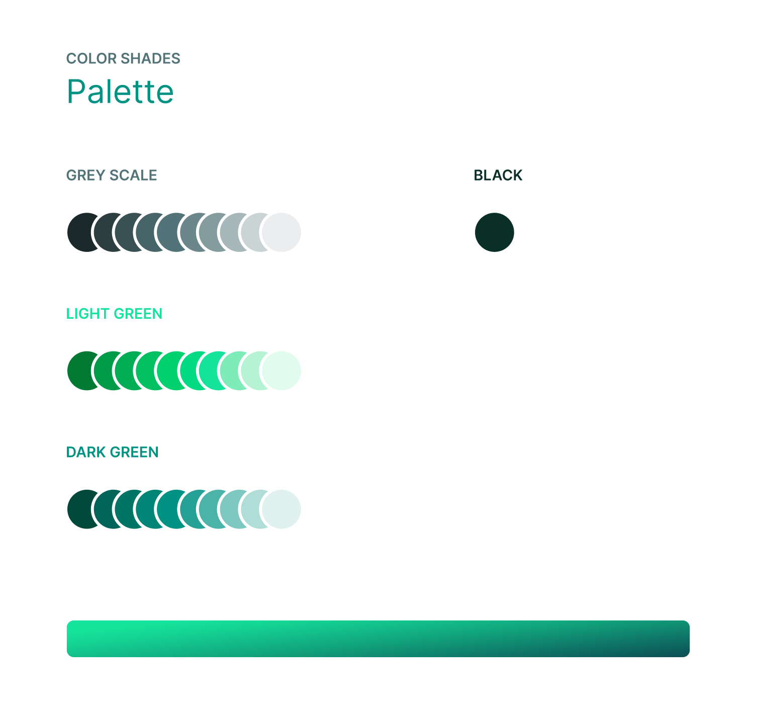
The external heptagon is colored with a seamless transition from the light green to the dark green. The gradient gives light and motion to the entire logo. Also, the two different colors make the logo easily readable on both white and black backgrounds: this is a very important property for a software. In fact, kube-green's repository is hosted on GitHub, that allows users to choose between a dark and a light mode, and so does the official website.
Conclusion
As you can see, there was a great effort behind this rebranding: we strive to do everything we can to make kube-green work better, and we believe that its success will depend also from its recognizability.
We believe that a great software needs a strong identity, and we did our best to give kube-green a long-lasting brand identity.